EMPLOYER WELCOME PACKET
The Career Center at Brigham Young University - Idaho
Week 1-5:
-
Deep dove into past employer welcome packets.
-
Assessed what has worked and what has not.
-
Looked at statistics of students.
-
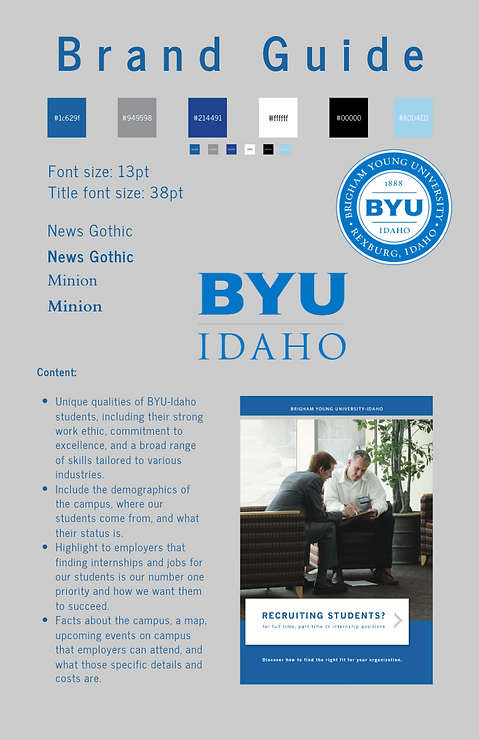
Made a brand guide for the pamphlet.
-
Made an outline of what points need to be made.
-
Contacted photography for photos to include.
During the first five weeks of this project, I focused on improving the employer welcome packets to make them more useful and engaging. I started by digging through old packets to see what had been done before, figuring out what worked well and what didn’t. Some things made sense and were helpful, while others felt outdated or unnecessary. I wanted to make sure the new version was actually useful for employers and made a good impression of what BYU-I really is.
I also looked at student statistics to get a better idea of who these packets needed to represent. Understanding those numbers helped shape what kind of information should be included. To keep everything looking professional and consistent, I put together a brand guide for the pamphlet, making sure fonts, colors, and layouts all matched up in a way that made sense. Then, I outlined the key points that needed to be covered so the information would be clear and easy to follow.
Since visuals make a big difference, I reached out to the university’s photography department to get high-quality images for the packet. Having the right photos helps make the whole thing feel more polished and engaging. Overall, my goal was to create a packet that employers would actually want to read and that it was something clear, useful, and professional, without feeling cluttered or overwhelming.


Week 5-7:
-
Focused on designing and refining pages 1-3 of the employer welcome packet.
-
Researched what makes BYU-Idaho unique and how to present it to employers.
-
Did the "Why BYU-I?" section using stats, facts, and compelling messaging.
-
Formatted the table of contents to make the packet easy to navigate.
-
Made sure the design matched the brand guide.
-
Revised and refined the content to make it clear, impactful, and inviting.
These past few weeks, I focused on making the first few pages of the employer welcome packet not just informative, but engaging and easy to follow. The "Why BYU-I?" section was a big part of that. I wanted to make sure it told a strong, clear story about what sets the university apart. To do that, I dug into the research, pulling together key stats and insights that would help employers see the value of hiring BYU-I students.
I also worked on formatting and design, making sure the first impression of the packet felt polished and professional. The table of contents needed to be clear and intuitive, so I spent time structuring it in a way that made sense. At the same time, I refined the layout, ensuring fonts, colors, and spacing were consistent with the brand guide.
Throughout the process, I kept reviewing and tweaking to make sure everything flowed smoothly. My goal was to create something that wasn’t just another packet of information, but a visually appealing and well-organized guide that employers would actually want to read.
Week 8-9:
-
Focused on refining the front page design and overall layout.
-
Worked on integrating design with words for a cohesive and visually appealing format.
-
Ensured consistency in fonts, colors, and spacing to align with branding.
-
Incorporated statistics to add credibility and engagement.
-
Consulted with my mentor for feedback and direction.
-
Made adjustments based on feedback.
These past two weeks, I concentrated on the design and structure of the project, making sure everything felt polished and professional. The front page was a major focus, as I wanted it to make a strong first impression while also setting the tone for the rest of the document. I tried out a ton of different campus photos for the background. I'd love for some feedback.
Beyond just visuals, I worked on the balance between design and text to ensure that formatting, spacing, and word choice complemented each other. I also included key statistics of students and the campus to strengthen the messaging, making the content more compelling and data-driven.
Meeting with my mentor, Janet, was an important part of this process, allowing me to gain insights on how to refine my approach. Based on feedback, I made necessary revisions to enhance both readability and impact. My goal was to create something that wasn’t just well-designed but also structured in a way that made the information clear, engaging, and showing what the Campus really offers.


Week 10-11:
-
Focused on researching and designing the student stat sheet.
-
Pushed to complete it early for my mentor’s alumni trip to Washington, D.C.
-
Spent hours refining the layout to make the stats clear, engaging, and visually appealing.
-
Double-checked data for accuracy to ensure credibility.
-
Made adjustments based on feedback to improve clarity and impact.
These past two weeks have been all about the student stat sheet. My mentor needed it earlier than planned, so I had to really buckle down and get it done ahead of schedule. A lot of my time went into digging up the right data and making sure everything was accurate and up to date. I wanted the final product to not just be informative but also something that grabs attention and sticks with people.
Design-wise, I worked on making the numbers easy to read while still looking polished and professional. I spent way too much time tweaking fonts and spacing, but I think it was worth it!
Even though the quick turnaround was a bit stressful, I’m happy with how it turned out. Hopefully, it helps make an impression in D.C.! If you have any thoughts on making stat sheets even more effective, I’d love to hear them.

.jpg)